Research and application of light and color
Huang Yumin
Guangzhou Light and Shadow Lighting Technology Co., Ltd.
There is no color without light. Light is a necessary condition for people to perceive color. Color comes from light. Therefore, light is the source of color, and color is the expression of light.
In the colorful world of colorful and colorful, the color makes the universe full of emotions and looks vibrant. As the most common form of aesthetics, color exists in all aspects of our daily lives. Clothing, food, shelter, travel, and use, people are almost all-inclusive, and there is a close relationship with color all the time. The color phenomenon is a natural scene that changes a lot. Without color, there is no red, green, green, no color, no blue sky, no color, no poetry, no music, no art. A world without color is undoubtedly a dark and dead world. People's life is surrounded by beautiful colors from beginning to end, and in this encirclement, they feel the beauty of time, the warmth of time, and the joy of life. Color phenomena are objective and eternal.
First, the basic knowledge of light
People's understanding of the nature of light dates back to the seventeenth century. From Newton's particles to Huygens's elastic fluctuations, from Maxwell's electromagnetic theory, to Einstein's theory of light quantum, to modern wave-particle duality theory.
The physical properties of light are determined by its wavelength and energy. The wavelength determines the color of the light, and the energy determines the intensity of the light. In the range of electromagnetic radiation, only radiation with a wavelength of 380 nm to 780 nm (1 nm = 10-6 mm) can cause people's visual perception. This light wave is called visible light.
In this visible spectrum, different wavelengths of radiation cause different color perceptions. British scientist Newton discovered in 1666 that the sunlight was refracted by the prism and then projected onto a white screen, which would show a beautiful spectrum of light like a rainbow. Starting from red, orange, yellow and green were followed. Green, blue and purple.
Second, the visual nature of light
Vision is a feeling caused by the visible light entering the eye. In the process of understanding the objective world, more than 90% of the information obtained from the outside is obtained through vision. The efficiency and quality of information obtained are related to the visual characteristics of the eyes, lighting conditions and visual comfort. The physiological characteristics of the eye determine its light and dark vision and visual performance. The main factors affecting visual comfort and causing visual fatigue are illumination level, illumination uniformity, glare and changes in light and dark vision. This is the basics of studying optics.
Shading
   The vision is divided into bright vision, dark vision and intermediate vision. Ming vision is primarily acted upon by cone-shaped cells on the retina of the eye, usually requiring a brightness of at least a few candelas per square meter (cd). Dark vision is mainly caused by the rod-shaped cells of the retina, and the required brightness is generally less than a few thousand candelas per square meter (cd). The intermediate vision is between the above two kinds of vision. Rod cells cannot function to distinguish colors, and only cones feel the color when they are stimulated by light. Rod cells are most sensitive to light with a wavelength of 510 nm, while cone cells are most sensitive to light with a wavelength of 550 nm.
The ability to complete the visual performance <br> eye visual work called visual performance. Commonly used brightness contrast and color contrast, contrast sensitivity, visual acuity, and visual sensation speed to comprehensively evaluate the visual performance of the eye. The ability of the eye to recognize any object on a background depends primarily on the difference in brightness and color between the object and the background, ie brightness contrast and color contrast.
The minimum brightness difference between the object that the eye can discern and the background is called the critical brightness difference. The ratio of the critical brightness difference to the background brightness is called the critical contrast. The ability to evaluate the minimum contrast of the eye using the reciprocal of the critical contrast is called contrast sensitivity.
Visual acuity is the reciprocal of the eye's resolution of the angular separation of two adjacent objects (points or lines) (usually expressed in angular divisions); visual acuity is also the reciprocal of visual acuity.
The perceived speed is the reciprocal of the minimum time necessary for people to experience the image.
Third, the color of light
There is only light in nature, and there is no color. The human eye establishes the concept of color in order to distinguish the difference of light. Most of the theory about color is based on the experiment of people's feelings. There are three kinds of proteases in the human eye, which are sensitive to one of red, green and blue light of a specific wavelength, so that in fact, one can only perceive three characteristic directions in one spectrum. 
Color is a kind of visual experience. The objective world forms information through human visual organs, which makes people know about it. Therefore, vision is the beginning of human understanding of the world. All visual images from the outside world, such as the shape, space, location of objects, and their boundaries and differences, are reflected by the relationship between color and light and darkness.
For an object that emits light itself, the color is determined by the stimuli in the three directions that the light emitted by the human eye can perceive. For a reflective object, however, the color is determined by the incident light that illuminates him and the light that he absorbs. A set of red, green and blue light with the same white eye light in these three specific directions can simulate the effect of white light in the human eye, but when the white light and the red, green and blue light respectively shine on the same object When you are above, the light that is absorbed is different, and the reflected light is not necessarily the same. The color of the object you see may be different.
The color of an object is determined by the transmission, absorption, and reflectance spectra of the object. Different incident rays may cause different colors of the object. We said, "Flower is red 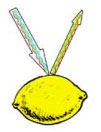 "Color" is because it absorbs blue light of 400-500 nm in white light and green light of 500-600 nm, and only reflects red light of 600-700 nm. The flower itself has no color, and light is the source of color. If red The surface is illuminated with green light, then it appears black, because the radiant energy of the green wavelength is completely absorbed, it does not contain the wavelength of the red light that can be reflected. It can be seen that the object will be exposed to light of different spectral composition. Different colors. Therefore, "color" is not the physical entity of matter itself. Only the wavelength of light wave is a physical reality. The intrinsic property of an object is its ability to absorb or reflect on certain bands in the visible spectrum.
Fourth, the physiological characteristics of light color
From the physiological characteristics of the visual eye, it is found that the cone-shaped cells of the human eye are in the center of the retina, and its ability to distinguish small objects is strong, while the rod-shaped cells are at the edge of the retina, which is more able to feel the stimulation of weak light. The ability to distinguish small objects is weak. Under the visual state of the human eye 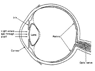 The cone-shaped cells, mainly in the center of the retina, produce a visual effect with a maximum visual response at 55 nm in the blue-green interval of the spectrum. As the level of illumination decreases, the rod-shaped cells around the retina are gradually activated. In the dark state, the rod-shaped cells mainly produce a visual effect, and the peak visual response is 507 nm. Cone cells and rod cells act simultaneously in an intermediate visual state between bright and dark vision. Peripheral vision is primarily affected by rod-shaped cells, which are more sensitive to short-wavelength light. Because of this, when the brightness of the environment is different, the type of cells that work in the human eye is different, and the feeling of color will be different.
Light waves of different colors have different levels of stimulation when the energy is equivalent. For example, under the illumination of the same energy and different colors, the brightness is different. For example, it feels brighter than dark blue. We usually refer to light colors such as white, yellow, and light red as bright colors, and heavy colors such as emerald green, blue, and black are called dark colors.
Five, the psychological feeling of light color
Color psychology is a very important subject. In terms of natural appreciation and social activities, color is objectively  A stimulus and symbol to people; subjectively a reaction and behavior. Color is associated with human feelings (external stimuli) and human perceptions (memory, association, contrast...). Color perception always exists in color perception, and there are few isolated color feelings. Color psychology begins with vision, from perception and affection to memory, thought, will, symbol, etc. The reactions and changes are extremely complicated. The application of color attaches great importance to this causal relationship, that is, from the accumulation of experience in color to the psychological norm of color, what kind of reaction can be produced when stimulated, is the content of color psychology to be explored.
Another difference between psychological color and colorimetric color is that colorimetry studies color light itself without involving research. 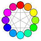 Factors such as the environment and the position of the observer in space and the change in viewing angle. For example, the background of the shaded light is dark and colorless in the CIE system, and experiments have shown that different backgrounds do not change the matching values. However, visual color is not the same. When the background changes, many psychological effects such as color resolution, hue, saturation, and brightness will change.
When the two colors of light add white light, the two colors are mixed to appear grayish black, then the two colors and the two colors are complementary colors. The position of the complementary color is on both ends of a diameter on the hue ring, that is, the position of the apex angle.
Psychologically divides the colors into red, yellow, green, and blue, and is called the four primary colors. Usually red-green, yellow-blue is called psychological complementary color.  No one can imagine that white is mixed from these four primary colors, and black cannot be mixed from other colors. Therefore, red, yellow, green, blue plus white and black, become the six basic feelings of psychological color visual. Although physical black is the case where the human eye is not exposed to light, many people in psychology believe that it is only without feeling that light is not, and black is indeed a feeling. For example, the feeling of looking at a black object and closing your eyes is different.
The direct psychological effect of color comes from the direct influence of physical stimulation of color on human physiology. Psychologists have done many experiments on this. They found that in a red environment, people's pulse will speed up, their blood pressure will rise, and their emotions will be excited. In the blue environment, the pulse will slow down and the mood will be quieter. Cool color and warm color are the physical classification of color according to psychological illusion. For the material impression of color, there are roughly two colors of cold and warm. The long-wavelength red light and orange light and yellow light have a warm feeling; on the contrary, the short-wavelength purple light, blue light, and green have a cold feeling. The addition of cool and warm colors gives us a different feeling of temperature and brings other feelings. For example, warm colors are heavy, cold colors are light; warm colors have a strong sense of density, cool colors have a thin feeling; cool colors have a feeling of retreat, warm colors have a sense of approach. These feelings are biased towards the physical impression, not the physical reality, it is a psychological illusion.
The psychological illusion of materiality caused by color is one of the most available means for artists or designers. Usually in a narrow space, if you want to make it spacious, you should use a bright cold tone. Because the warm color has a sense of advancement, the cool color has a sense of backwardness. In the long and thin space, the two walls are painted with warm colors, and the two walls are painted with cool colors. The space will feel closer to the square from the psychological.
Symbols of various colors:

Red - warm, lively, lively, revolutionary, warm, happy, auspicious, dangerous...
Orange - bright, gorgeous, excited, sweet, happy...
Yellow - bright, happy, noble, hope, development, attention...
Green - fresh, calm, comfortable, peaceful, soft, youthful, safe, ideal...
Blue - far-reaching, eternal, quiet, rational, honest, cold...
White - pure, pure, simple, sacred, bright, weak, nothing...
Black - sublime, serious, strong, solid, rough, silent, dark, sinful, horrible, desperate, dead...
Color itself does not reflect thoughts and feelings. However, in the process of human understanding and transformation of the objective world, the color of natural scenery has gradually caused a certain psychological impact on people, resulting in feelings of warmth, softness, softness, distance, lightness and weight, as well as various associations caused by color. . For example, from red to flame, blue to sea, this association creates a clear concept that makes people feel different about different colors. In short, the color we see is a reflection of the part of the light that is stimulated by the colored object to stimulate our eyes and produce in the mind.
Sixth, the impact of the environment on color
Color is a visual sensation that affects the visual characteristics of the human eye, and human visual characteristics are governed by the brain and also a psychological reflection. Therefore, the color perception is not only related to the original color characteristics of the object, but also affected by the time, space, appearance state and the surrounding environment of the object, and is also affected by various factors such as individual experience, memory, perception and visual sensitivity. influences. In addition, the distance of the viewing distance, the size of the object, the surface roughness of the object, etc. all affect people's perception of the color of the object.
1, change in brightness
The natural light source is affected by climatic conditions, and the brightness changes at any time, which is very unstable. The intensity of sunlight, such as sunny and cloudy days, varies greatly. Artificial light sources are more stable than natural light sources, but they also have variations in brightness. For example, incandescent lamps, when the brightness is increased, the color tends to white; when the brightness is weak, the color tends to be red. The change in brightness of the light source has a direct effect on the color of the object. The intrinsic color of the object is most adequate when the brightness of the incident light is moderate. Too bright glare will make the inherent color lighter, and too dark will make the inherent color dark or even disappear.
2, the change of distance
A change in the distance between the light source and the observer causes the color of the light source to change. Like incandescent light, as the distance pushes farther, its color changes from yellow to orange, orange red, and red.
The effect of the color of the light source on the color of the object is mainly reflected in the bright part of the object. The influence of different light source colors on the color change of the object is different, and the red light is the strongest, the white light is the second, and the green, blue, blue, and purple are again.
3. The influence of ambient color on the color of the object
The color of an object in standard daylight is called the intrinsic color.
Everything in nature has its own intrinsic eigenfrequency and has a fixed selective absorption characteristic for incident white light, which has a fixed reflectivity and transmittance. Therefore, the color of objects seen by people under standard daylight is stable. The intrinsic color gives the most impressive impression, forming a memory, also known as the memory color.
The effect of the ambient color on the color of the object is more pronounced in the dark part of the object. The influence of the ambient color on the color of the object depends on the strength of the ambient color, the distance between the adjacent object and the object being viewed, the degree of surface roughness and color of the object being viewed. Generally speaking, the closer the adjacent object is to the object being viewed, the smoother the surface of the object being viewed, and the stronger the reflected light, the greater the influence of the environment on the color of the object being viewed. Conversely, the farther away from the adjacent object, the rougher the surface, the lighter the color, and the smaller the object is affected by the ambient color.
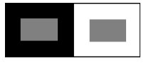
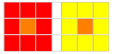
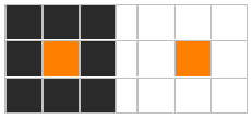
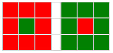
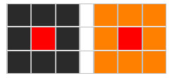
There is another form of the effect of the environment on the color. As shown in the figure, the small squares in the center all have the same gray scale, but because of the influence of the surrounding colors, people have different feelings for each color block. Therefore, if the viewing conditions are not determined, the physical properties of the same color block and the visual feelings caused by it cannot be unified. A set of standard viewing conditions was recommended for this International Standard Lighting Commission (CIE).
|
The basic color feature of an object is an intrinsic color, but the color of the surface of the object is rich and varied due to the influence of the color of the light source and the color of the environment. The color that an object presents in a particular light source and environment is called a conditional color. The color of each object is a combination of the inherent color and conditional color of the object. In general, the inherent color of an object is easy to confirm, while the conditional color is complex. A good light art work is precisely the conditional color to fully reflect its complex spatial relationship.
Seven, the color of the mixture
The wavelengths of several individual sources are added together by energy.
A mixture of light colors. The brightness is increased, and the total brightness of the mixed colors is equal to the sum of the brightness of the mixed colors. The color aspect is  It is determined by the energy of the spectrum of different light sources.
In the mixing of color and light, the three primary colors are vermilion, emerald green, and blue-violet, and they cannot be mixed with other colored lights. Zhu Hong and emerald green mixed yellow light; emerald green and blue purple mixed with blue light; blue purple and vermilion mixed with purple red light; yellow light, blue light, purple light for inter-color light. When the three-source color light is mixed in a certain ratio, the obtained light is achromatic white light or gray light.
In terms of mixed colors, the colors of psychology and color are different. When you see orange, you will feel that it is a mixture of red and yellow. When you see purple, you will feel a mixture of blue and red. But when you see the yellow light, you don't feel that the yellow light can be made up of red and green light. In the psychological color visually, all colors "like" cannot be mixed by other colors. Generally, the color is red with yellow orange, green with blue green, green with yellow grass green, but there is no yellow with blue or red with green color.
What is usually seen is not only the color, but the color and the object, not just the colored light, but the mixed color light that is sandwiched with many other lights, which further complicates the problem.
Eight, the illusion and illusion of light and color mixing
Color Assimilation - When a certain color is surrounded by other colors, if the surrounded color is very close to the surrounding color in terms of hue and brightness, or the contrast between the two areas is very large, the area surrounded by the color is small, then surrounded The color will be "eaten" by the color of the envelope. This color phenomenon is called color assimilation. The reason is that the visual stimulus value of the color contrast is smaller than the visible value of the vision. For example, on a large area of ​​light yellow background with a light orange that is very close to this color, orange does not work visually. When the color is composed, the contrast between hue, brightness, purity and area ratio should be properly adjusted, and the visual effects of each color should be fully utilized to reduce the effect of color assimilation.
Conservation of color vision - the color perception of the brain's visual information from the eye, sometimes not entirely objective, with more or less subjective color components. Under the illumination of different light sources, the same object should objectively change its physical color effect due to changes in spectral composition, but people will still judge it by listening to the accumulated color memory in life experience. The long-standing impression of sun exposure as the so-called "inherent color" that determines the color standard of objects is not negligible. This subjective color phenomenon in color science is the conservation of color perception. For example, the coal under the illumination of strong light and the cotton under the faint light of the evening, from the optical and physical point of view, the "black" of coal under the illumination of bright light is brighter than the "white" of the cotton of the weak light irradiation factory. There are many, but people still stubbornly believe that coal is "black" and cotton is "white" because color perception is often dominated by the color memory and association of black coal and white cotton. Since the external world that people see always undergoes a subjective correction of the world, in the process of color perception, all psychological factors other than vision are excluded, but it is very difficult to see pure color. Obviously, the subjective color vision conservation always “turns a blind eye†to the change of carbon black under the illumination of strong light.
The color perception of an object is always related to the composition of the spectrum of the light source. Under the illumination of sunlight and fluorescent lamps, the conservation of color perception is obvious. Under the illumination of neon, mercury, and sodium lamps, the color perception of the object is lower due to the simple spectral composition. Secondly, the color perception constant is related to the light and dark environment in which the object is located. In the bright environment, the color perception is constant, and the darkness is low in the dark environment.
Nine , the contrast of light and color
At the same time, the contrast effect - the result of the adjacent color changes the original nature, with complementary color of the adjacent color.
The same black is greenish-gray on the red base, reddish-grey on the green base, yellow-gray on the purple base, and purple-gray on the yellow base.
The same gray has a complementary background color on the red, orange, yellow, green, cyan, and purple backgrounds.
Red and purple are juxtaposed, red tends to orange, and purple tends to blue. Adjacent colors tend to push each other toward their complementary color.
Contrast effect - When you look at a color and look at a color, the complementary color of the previous color is added to the latter color. For example, when you look at the green and look at the yellow, the yellow has a bright red feeling. In the state of color contrast, due to the interaction, it is different from the color seen alone. This phenomenon is caused by visual residual images. When we look at a certain color pattern for a short time, and then look at the white background, there will be a complementary color pattern with a similar hue and brightness relationship. If the background is colored, the afterimage color is mixed with the background color. In the case of juxtaposition, there is a mutual influence. So when we do the color scheme design. It should be considered that the visual effect formed under the residual color image is treated accordingly.
Edge contrast - When comparing two colors, the contrast effect is the strongest at the edge of the two colors. This phenomenon is called edge contrast. Especially when the two colors complement each other, the contrast is stronger. Red and green are complementary colors, forming a strong contrast. The edges of the two colors have a dazzling edge, and there is actually no edge. This is the illusion of strong contrast.
Color contrast - put the same orange in red or yellow, we will find that the orange on the red will have a yellowish feeling, because orange is made of red and yellow, when he and red are juxtaposed The same ingredients are reconciled and the different parts are enhanced, so it looks more yellow than when it is alone. This phenomenon is also seen in other colors. We call it color contrast.
   Comparison of brightness - the contrast formed by the difference in brightness in the three attributes of color is called brightness contrast. A person with a high brightness will appear brighter, and a person with a low brightness will appear darker. For example, the same brightness color will appear dark on a white background and brighter on a black background. With the mutual contrast of light and dark colors, color styling can play a role, and the image can stand out.
   Complementary color contrast - when two colors that complement each other are combined, it will produce a noticeable effect, making the colors more intense. For example: red and green juxtaposed, red more red, green more green.
Purity contrast - when the color is juxtaposed with another color with higher purity, it will feel lower in purity, and when it is in another color with lower purity, the purity will become higher. This phenomenon is called purity comparison.
The rules of color contrast are summarized as follows:
1. Bright and dark colors are adjacent, brighter is brighter, darker is darker; gray is more juxtaposed with bright colors, brighter is more brilliant, gray is more gray; cold and warm colors are juxtaposed, colder is colder, warmer is warmer .
2. When different hue is adjacent, they tend to push each other to their complementary colors.
3. When the complementary colors are adjacent, due to the strong contrast effect, each of them adds complementary light, and the vividness of the color also increases.
4. The contrast effect increases with the increase of purity, and the edge portion is the most obvious at the same time.
5, the contrast effect can only be produced when the colors are adjacent, and the effect is most conspicuous when one color surrounds the other color.
Ways to enhance the contrast effect:
(1) Improve the purity of contrasting colors and enhance the contrast of purity;
(2) Make the contrast color establish a complementary color relationship and strengthen the relative effect of the color;
(3) Expand the area contrast relationship and strengthen the area comparison effect.
Ways to suppress contrast:
(1) change the purity, improve the brightness, and ease the contrast of purity;
(2) destroy the complementary relationship and avoid strong contrast of complementary colors;
(3) Adopting the method of interval and gradation to buffer the color contrast effect;
(4) Reduce the area contrast relationship and establish an area balance relationship.
For example, the orange ash on the orange bottom can strengthen the contrast; while the yellow ash on the orange bottom can suppress the contrast.
X. Application of color in night lighting
In the night lighting application, the pursuit is the effect. In visual art, color is more profound as the artistic charm of giving people the first visual impression, often with the power of pre-emptive. When people observe objects, the visual nerves reflect the color the fastest, followed by the shape, and finally the texture and details of the surface, vividly illustrating the importance of color in art design. With the advancement of the times, people's spiritual and material life will continue to improve, and they will increasingly pursue the beauty of color. Night scene lighting is in this context, the application of night architectural landscape lighting color is more and more extensive. The night view of the city has become a material and spiritual enjoyment. Therefore, lighting artists always use color to give specific emotions and connotations in design works.
Night lighting requires that the illuminated object have a certain brightness, color, uniformity, glare as little as possible, and reduce light pollution, coordinate with the environment, reflect more human characteristics, etc., reflecting the comprehensive effects of multiple disciplines. Night illumination is generally at night or in a relatively dark environment, and its brightness range is generally between 10 and 3 cd/m2, when the human eye is in an intermediate visual state. There are many differences between the visual function in the intermediate visual state and the visual function of the bright and dark vision, which will have a certain influence on the measurement and calculation of the illumination design in the intermediate visual state. Therefore, the influence of intermediate vision should be considered in lighting design and lighting planning.
Eleven, a new concept is born - high-tech product mixed light
There are usually two types of performance methods for buildings: one is to use the shape and structural features of the building to express the building through hidden lamps, such as floodlights and floodlights, which are characterized by the human eye. The light source expresses the building through light and the light through the building. People see the building  Its inherent morphological features, as well as the color characteristics presented under artificial light. People rarely feel the existence of light. Another method is to utilize the external structure of the building. The luminaires that can be directly viewed through the plug-in (generally low power, low brightness), such as neon, fiber optics, LED, etc., are characterized by discoloration, easy programming control, people's eyeballs are attracted by dazzling lights, and the light is seen. It is colorful and pleasant, but it is rarely reminiscent of the building itself.
While expressing the building, people feel the existence of light. The new type of mixed light "Euroleux" is to fully understand and use the knowledge of light in color, through the visual system to the light and dark feeling characteristics; The sensory properties of color; the sensory properties of space and the temporal response characteristics of light stimulation. Using the patented technology, the T-Sport+W-TuneII optical system designed with advanced optical control principle allows two or three sets of different spectra of light to be mixed in the controlled area and then projected onto various prepared objects. The human eye has a unique and distinct visual effect.
Through the different spectra, different strengths and weaknesses, the different light rays of the projection area are superimposed, and there is a mixture of light colors and a comparison of light colors. After the refraction and reflection on the surface of the illuminated object, the scene we observe by the human eye will have endless changes. It combines a variety of theories of light color: physiology, psychology, optical physics, color art, color psychology and more. Due to the application of a variety of optical principles, the use of accurate light control system, close to the object to be installed, greatly improving the utilization of light, reducing light pollution, saving energy, reducing investment 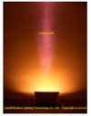 .
.
Color matching features:
1. Use adjacent colors
The so-called adjacent color is the color adjacent to the ribbon, such as green and blue, and the red and yellow are adjacent colors. The adjacent color design avoids color clutter and is easy to achieve harmony and unity. 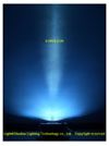
2. Use contrast color
Contrast color can highlight the key points and produce a strong visual effect. By using the contrast color reasonably, the website features distinctive and focused. In the design, generally a color as the main color, contrast color as an embellishment, can play a finishing touch.
3. Use monochrome
Although monochromatic is used to feel monotonous, the color of the mixed light is different from that of other lamps, and it has a special light distribution effect.  The areas where the strength of the line is distributed are different. In some cases, the application has a unique style.
The landscaping masters – the ever-changing color and shape “Euroleux†luminaires utilize the patented technology T-Sport+W-TuneII optical system, which has a strong artistic expression and can quickly create various environmental atmospheres ( Grand, elegant, active, quiet, steady, vivid, etc.)
According to the combination of power size and color, it is convenient to generate thousands of combinations, without the need for costly control system, plus the adjustment of the focus point, the light distribution also changes, the lighting effect is infinitely change, can meet different The individual requirements of the scene.
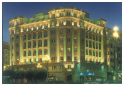
Even if the building itself does not have a prominent structure, the "Euroleux" (European Light) luminaire can be used to create a unique effect.
 |  |
Energy-saving and environmental protection pioneers - low power consumption and low glare "Euroleux" luminaires use only T-Sport high-efficiency optical system, only 70W power focusing  The point can still be clearly seen at 30 meters away, close to the brightness level of the same distance of ordinary floodlights 1000W. Since the installation is close to the object to be illuminated, the utilization of light is greatly improved, and light pollution is greatly reduced. Moreover, in practical applications, the number of lamps used is less than that of conventional lamps. While creating a unique landscape lighting effect, it can also save a lot of energy, in line with the national requirements for environmental protection and energy saving of landscape lighting. Generally, a project can reduce energy loss by 30% to 80%.
The T-Sport high-efficiency optical system makes the glare coefficient almost zero. That is, the person can directly look at the illuminated lamp outside the focus point. The W-TuneII optical system is well matched with the T-Sport high-efficiency optical system, making the light The segmentation is clear, the overall effect is harmonious and unified, and the optical control represents the current world advanced level.
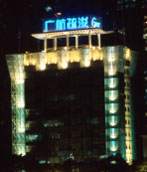
According to its own characteristics, the “Euroleux†luminaire does not need to be used in a large area and high power like traditional floodlights. Its installation requires a certain space distance, which can reduce the number of uses and reduce the installation workload. Save on investment and energy consumption. Moreover, the light source system can also be separately controlled according to requirements, thereby generating more changes and further saving energy. For example, on the right, the left lighting effect is represented by 6 sets of “Euroleux†(European Light) lamps with a power of only 140W. 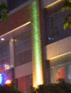 The lighting effect is 4 sets of ordinary floodlight 1000W lamps.
Wide range of applications ---- adapt to a wide, reliable, easy to install,
"Euroleux" lamps have low power but high brightness, concentrated light at the required position, and strong performance. The glare is low and can be applied to buildings of various styles and heights without affecting adjacent buildings. The colors and shapes of the lighting effects are ever-changing, especially suitable for large-scale landscape groups, which vary widely and are not the same.
In addition to the unique patented technology, “Euroleux†also uses the electrical appliances provided by the famous German electrical appliance manufacturers “VS†and “OSRAMâ€. The matching light source is also provided by the famous professional German manufacturer “BLVâ€. High-pressure cast aluminum casing, sprayed with polyester paint, protection grade up to IP65, widely used in various places, including various architectural forms (classical architecture, modern architecture, etc.), landscape trees, landscape sculpture, bridge landscape, riverbank landscape And some indoor places and other landscapes. Different lamp body colors can also be selected according to the environment.
The floodlights provide a new application platform for studying the contrast and blending of various hue, lightness, and saturation in the hues of light blending. It also provides a new way of expressing landscape lighting.

Huang Yumin Guangzhou Light and Shadow Lighting Technology Co., Ltd. July 2006
Http://
references
1, color principle and color composition tranquility 2, color art [Switzerland] Johannes Eton. Du Dingyu translation 3, color history [day] City Yifu. Yajian, Xu desert translation 4, intermediate vision analysis of Fudan University Institute of Light Sources Yao Peiyu Lin Yandan Shao Hong Chen Dahua
Battery Charger,Solar Charger,Travel Charger
Motorcycle Battery Co., Ltd. , http://www.nscyclebattery.com